Client: ZEST, is a health-focused energy solution brand, based in Manchester, NH. Specializing in energy drinks, bars, and nutritious power foods.
Overview: When I see healthy energy drinks the bad taste is the first thing that comes to mind. Knowing this my goal was to focus on creating a product that looked vibrant, fun, and didn’t scream healthy. This strategy offers ZEST’s primary clientele a flavorful and nutritious choice, while also tapping into the unhealthy energy drink market. Doing this encourages healthier decisions overall, catering to diverse consumer preferences and promoting well-being.
Brand Value: At Zest Energy, we’re redefining the energy drink category with our commitment to both taste and health. Our drinks are designed to give you the boost you need, without the crash or guilt associated with current market options. By harnessing the power of natural caffeine, fruit juice, and cane sugar we can guarantee an all-around refreshing, energy-boosting, and tasty drink. Why settle for just the energy when you can have it all?
Deliverables: Drink Label, Logo, Instagram Post, and Poster
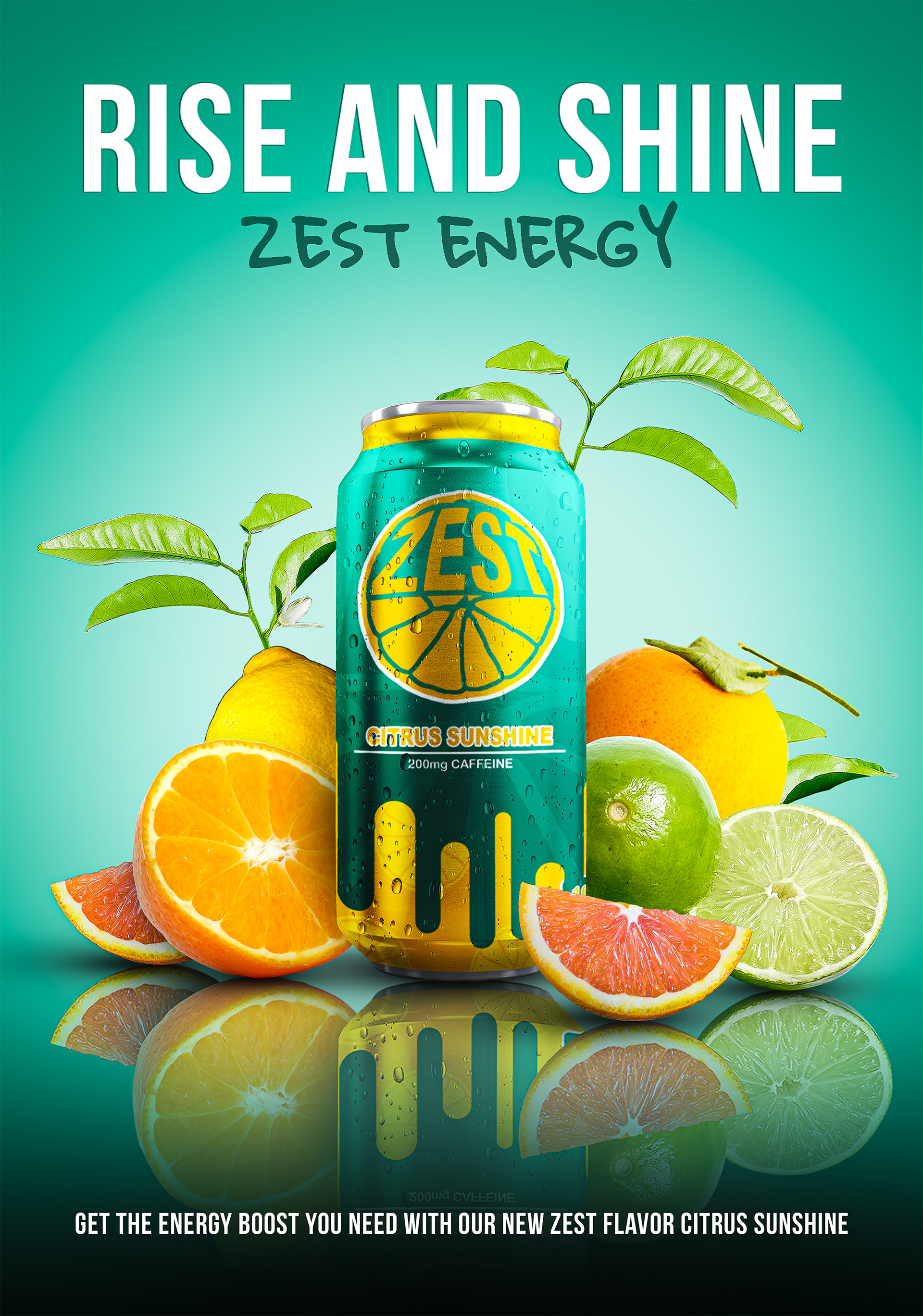

Challenge: From the start, I aimed for vibrant color contrasts against a gradient background. However, using gradient colors create readability issues for both white and black text. Opting for white text, I adjusted the hue and saturation levels of the gradient to ensure optimal readability. The last step in improving contrast was adding a thick background stroke to the text to provide a clear separation from the faded large logo. These changes seemed small but it took many different design choices and label versions to arrive at the solution.
