Client: Bruso’s Burritos runs a fleet of food trucks across key cities in North Carolina such as Raleigh, Charlotte, and Asheville.
Overview: Fun and inviting were the two main attributes the client wanted to convey. Alongside the illustration style, I consider the selection of color contrast as the two most crucial design elements in achieving the client's request.
Brand Value: Crafting burritos with passion. Our commitment to excellence ensures every bit is an experience worth savoring. A simple menu allows us to focus on quality ingredients and authentic flavors, delivering a burrito that surpasses expectations every time. We invite you to join us, savor the taste, and pass on the love.
Pattern: At first, I thought there were too many burritos everywhere but after looking at other restaurants many take a similar approach. I decided to use a simplified version of the logo and create a few color varieties to give the brand a consistent feel. Combined with the color pallet and pattern every single piece successfully screams Bruso’s Burritos.
Deliverables: Logo, Info Mailer, Business Card, Food Truck Wrap, Branded Paper Bag, Napkins, and Cup
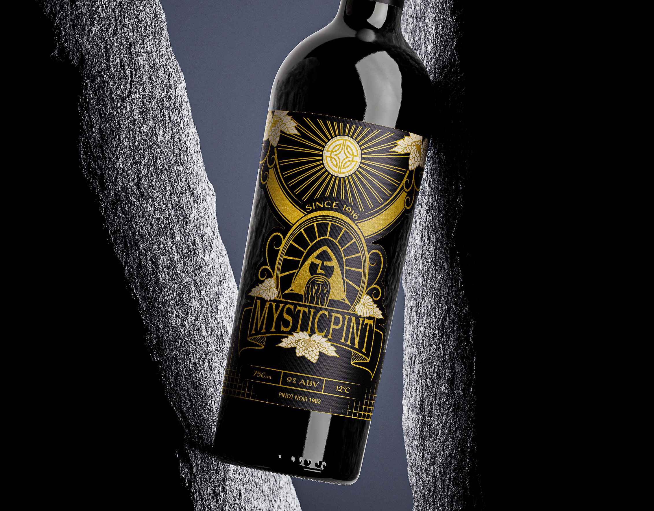
Logo Design: Uncertain about the brand’s visual identity, I chose to postpone the creation of the logo until after finalizing the label, leaving a placeholder circular frame for its future design. Symmetry, fantasy, and simplicity were all elements I tried to incorporate. Doing this would make the logo flexible for multiple use cases and would also allow for a cohesive overall brand design. The prominent bright star at the core symbolizes rarity, while the surrounding four leaves signify nature’s gift.
